Diagrams Are Conversations, Not Documentation
The most useful diagram of my career was ugly, partially wrong, and deleted within a week.
 Bartosz Frąckowiak · solution architect, co-leading an AI transformation for several hundred developers · about me
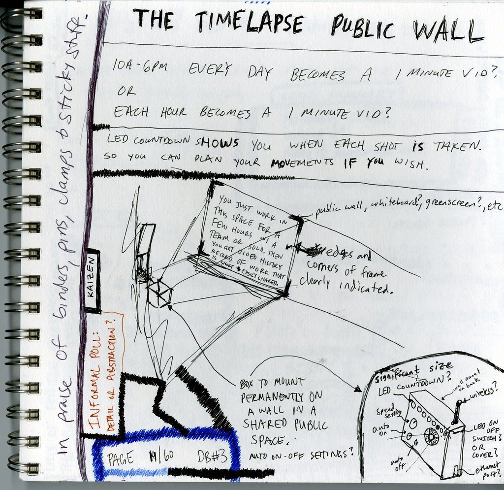
Early in my architecture career I spent three evenings polishing a system diagram. Aligned boxes. Consistent arrow styles. A legend. Color semantics. I presented it to the room, people nodded, someone said "great overview," and the meeting moved on. That diagram changed exactly nothing, and I was very proud of it.
A few years later I stood at a whiteboard with a marker I had to shake to make work, drew four crooked boxes, and before I finished the fifth a senior developer interrupted: "That's not how it flows. The events go through the queue first." Twenty minutes of arguing later, we had discovered that two teams held two different mental models of the same integration, and had been building against both.
The crooked boxes did more for the architecture than the three-evening masterpiece ever did. It took me embarrassingly long to understand why, so let me save you the time: a diagram's value is consumed in the meeting where it is drawn. What survives the meeting is a receipt.
The half-life problem
Polished enterprise-architecture diagrams are dead on arrival. Not because they're wrong on day one, but because the system starts drifting away from them on day two, and no contract of maintenance was ever signed. Everyone wants diagrams to exist; nobody has "update the diagrams" in their sprint. Nobody ever will.
Run this audit in your own organization: ask a team to show you their "current state" diagram, then watch the eyes. The honest answer is always some flavor of "current as of the workshop we ran in spring." We don't version diagrams. We hold funerals for them, quietly, by never opening the file again.
Meanwhile the messy whiteboard photo from that one heated session keeps getting reposted in chat threads for months. Not because the sketch is good (it objectively isn't). Because everyone who was in the room remembers the argument it hosted. The picture is a bookmark for a shared understanding. People who weren't there see boxes; people who were see the conversation. That gap is the whole point.
One diagram, one question
The everything-diagram is the most common failure I see: one canvas trying to answer every question about the system, and therefore answering none. Fifty boxes, four zoom levels, a legend that needs its own legend.
My working rule is brutally simple: one diagram, one question. Scope every drawing to the single decision it must support. "Should checkout call inventory directly or go through events?" needs five boxes. It does not need your cluster topology, and it absolutely does not need the boxes that are only there because leaving them out felt impolite.
Anything that doesn't influence the decision is decoration, and decoration invites feedback about decoration. You wanted a call on the integration pattern; you got forty minutes on whether the auth service should also be pictured.
One small trick changes everything: title the diagram with the question, not the system. "Where should risk aggregation live?" starts a very different meeting than "Platform Overview v7."
Draw live, don't present
The pattern I trust most costs nothing: draw the diagram in the meeting, badly, in front of everyone.
A finished diagram triggers politeness; people approve documents. An unfinished diagram triggers honesty; people cannot stop themselves from correcting a sketch. And the moment someone says "that arrow is backwards" is the exact moment your architecture is being validated, for free, by the people who know the ground truth. There is no cheaper review process on the market.
I'll admit why I resisted this for years: presenting polished work is a way of performing competence. Drawing crooked boxes in public feels junior. It isn't. It takes considerably more seniority to be visibly unfinished in a room than to be privately perfect ;)
The practical version: come with the question written at the top, draw the first three boxes yourself, then hand over the marker, literally or rhetorically. "What am I missing?" outperforms "any questions?" every single time.
The AI twist
And now the part that changes the economics of all of the above. AI agents will happily generate a C4 diagram, a sequence diagram, or a dependency graph from a paragraph of text: on demand, in seconds, regenerated whenever the code changes. The mechanical act of drawing, the thing that used to cost me three evenings, now costs approximately nothing.
Which exposes what was true all along: the scarce skill was never the drawing. The scarce skill is choosing what to show: which question, at which altitude, for which audience. An agent can render fifty boxes flawlessly; it cannot know that this particular room, on this particular Tuesday, needs exactly five of them and one uncomfortable arrow.
Diagram-as-artifact is deflating fast. Diagram-as-conversation is appreciating. Plan your skills portfolio accordingly.
So, a small experiment for your next design review: don't bring the finished diagram. Bring the question, an empty canvas, and the willingness to be corrected in public.
A marker you have to shake to make work is optional. In my case it helped.
 2026.09.28 · The agentic operating model, part 1
Every Approval Is a Missing Rule
If the architects do not write the rules the agents read, the person who writes the template does. Notes from reviewing an operating model for agentic delivery.7 min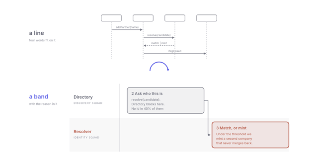 2026.09.14 · Diagrams, part 3
Turn the Sequence Diagram on Its Side
The people who can tell you a boundary is wrong were never going to read UML. Turn the sequence diagram on its side and they do not have to.8 min 2026.08.03 · Reviewability, part 1
The Bottleneck Moved
AI made writing code cheap. Our squad reports show where the queue went next: to the people who have to read it.6 min
Solution architect. I write weekly about software architecture, the humans around it, and the corporate machine they form together.
Comments
No comments yet. The floor is yours.
Leave a comment